CPS Brand Reimagining
In 2023, CPS had already rebranded, but after a series of acquisitions, questions were arising about how to best bring all the business lines together under one umbrella under one cohesive brand. I was asked to develop a concept for a new brand look and feel, which ended up being immensely successful, remaining as the brand image CPS uses today.
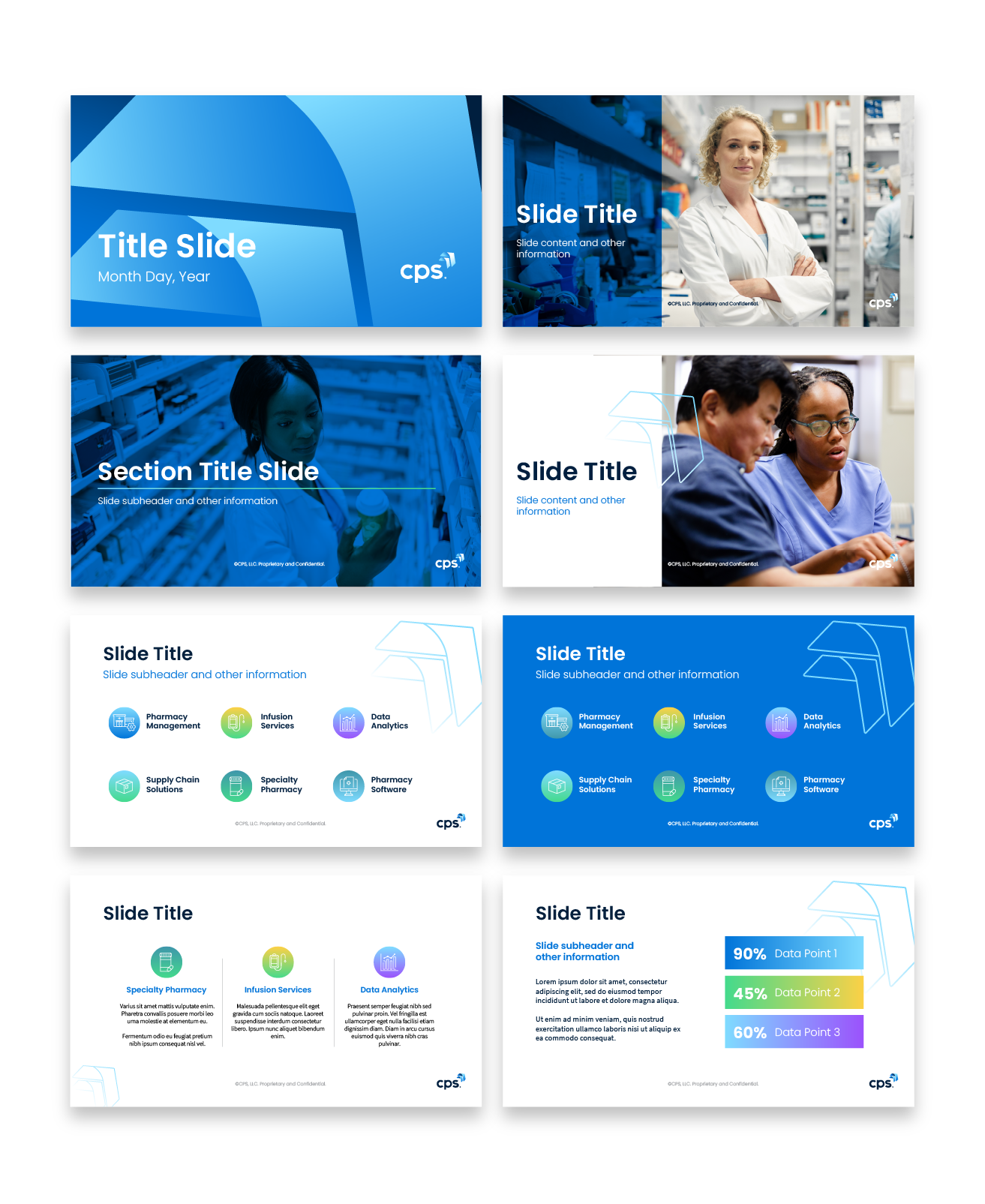
My core concept was bringing the brand a more human face by elevating the use of stock photography. I insisted on new standards for stock photos, both in terms of image quality and in image content. I posited that with polished photography featuring a diverse range of faces, both our customers and their patients would not only be able to see themselves better in our company, but also feel more excited about working with such a modern, forward-thinking company.
The inclusion of minimal brand accents helps to accentuate this feel.

Cleaner, Sleeker, Patient-Centric
I was given leeway to rework the CPS color palette, but was not allowed to touch the primary brand colors - a set of blues ranging from deep navy, to a bright cerulean, to a light sky blue. While I did not modify these colors, I did believe they could be used more effectively to provide the sense of polish and modernity I was looking to craft for the brand as a whole. The use of color overlays became a central pillar in my rework, allowing the stock photography to shine and connect on an emotional level while still giving space for the brand.

Effective Use of Color
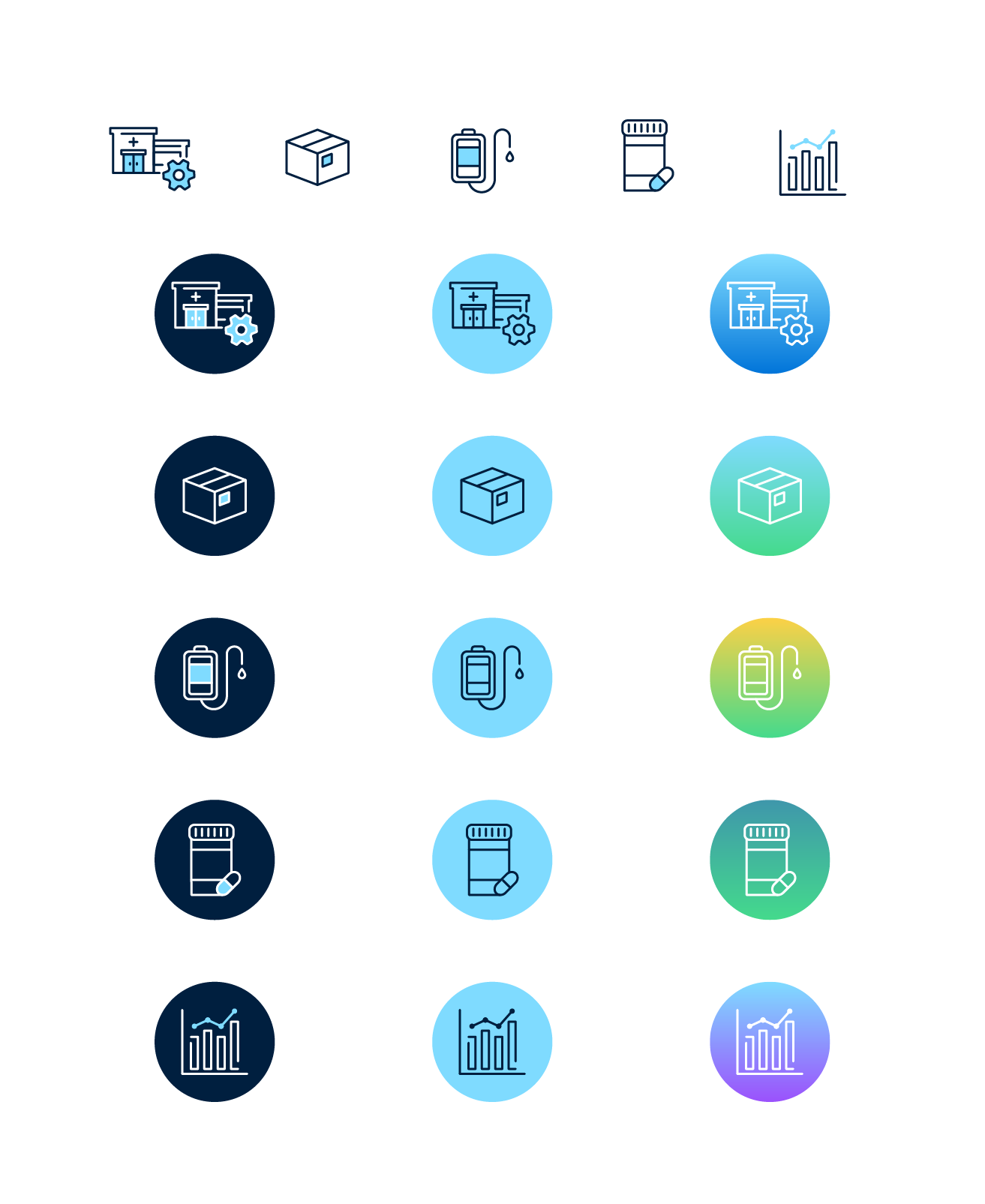
CPS was faced with a dilemma - with new brands under their umbrella they were also bringing in new people, who had been working under those brands and were used to them, proud of them, and in some cases, even very attached to them. To help them feel welcome and show them what a commitment CPS had to supporting them and their excellent work, I used the brand palettes of the numerous new brands and mixed them together, bringing in the teals, yellows, greens, and purples of the new subsidiaries. It was a brand everyone could see themselves in and feel proud to support, while still maintaining the CPS look and feel.
Including Everyone
Numerous people had expressed frustration with the brand’s current PowerPoint, so a big part of my task was to redesign the template deck to look new, fresh, and exciting, but also have ease of use. My final result was a deck that included stock images of confident pharmacists playing a key role in the healthcare ecosystem, coupled with a wide array of clean templates with plenty of space to work on. An included icon repository made dragging in custom icons easy, and visually striking title slides made even simple decks look innovative and striking. The new look was a big hit with the staff at conventions.