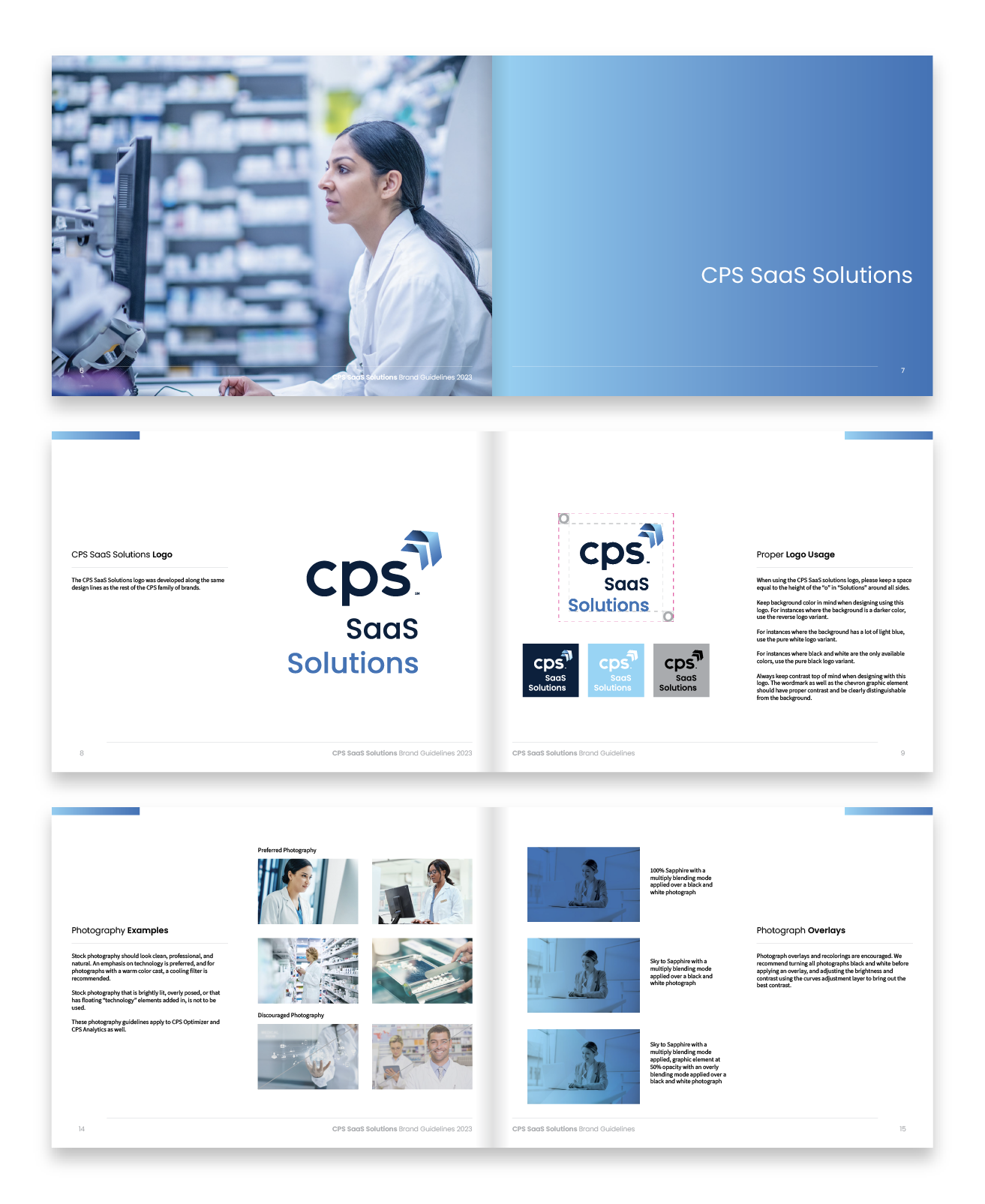
CPS SaaS Solutions Brand
In late 2022, CPS’s SaaS technology offerings were packaged up under one family of brands. I acted as chief designer for the new look and feel as well as the new suite of logos, uniting SaaS Solutions, CPS Analytics, and CPS Optimizer into one cohesive group.
IThe SaaS solutions brand needed to tie in to the larger CPS corporate brand and also look similar to the other brands beneath the CPS umbrella. I created the SaaS solutions logo to be in line with the look of the logos of other CPS offerings, but made sure to include specifications for photography and gradient usage that set the brand apart. Tasteful photography and cool blue gradients help to set the brand apart as a decidedly technology-focused brand.
Overarching Brand
The CPS Optimizer brand was part of a larger collaborative effort, with the logo being heavily workshopped through a series of design sessions including the marketing, product, sales, and developer teams. The final logo features the word optimizer in italics, implying a progressive, forward motion, with stylized chevrons from the CPS logo topping both i’s helping the feeling of acceleration along.
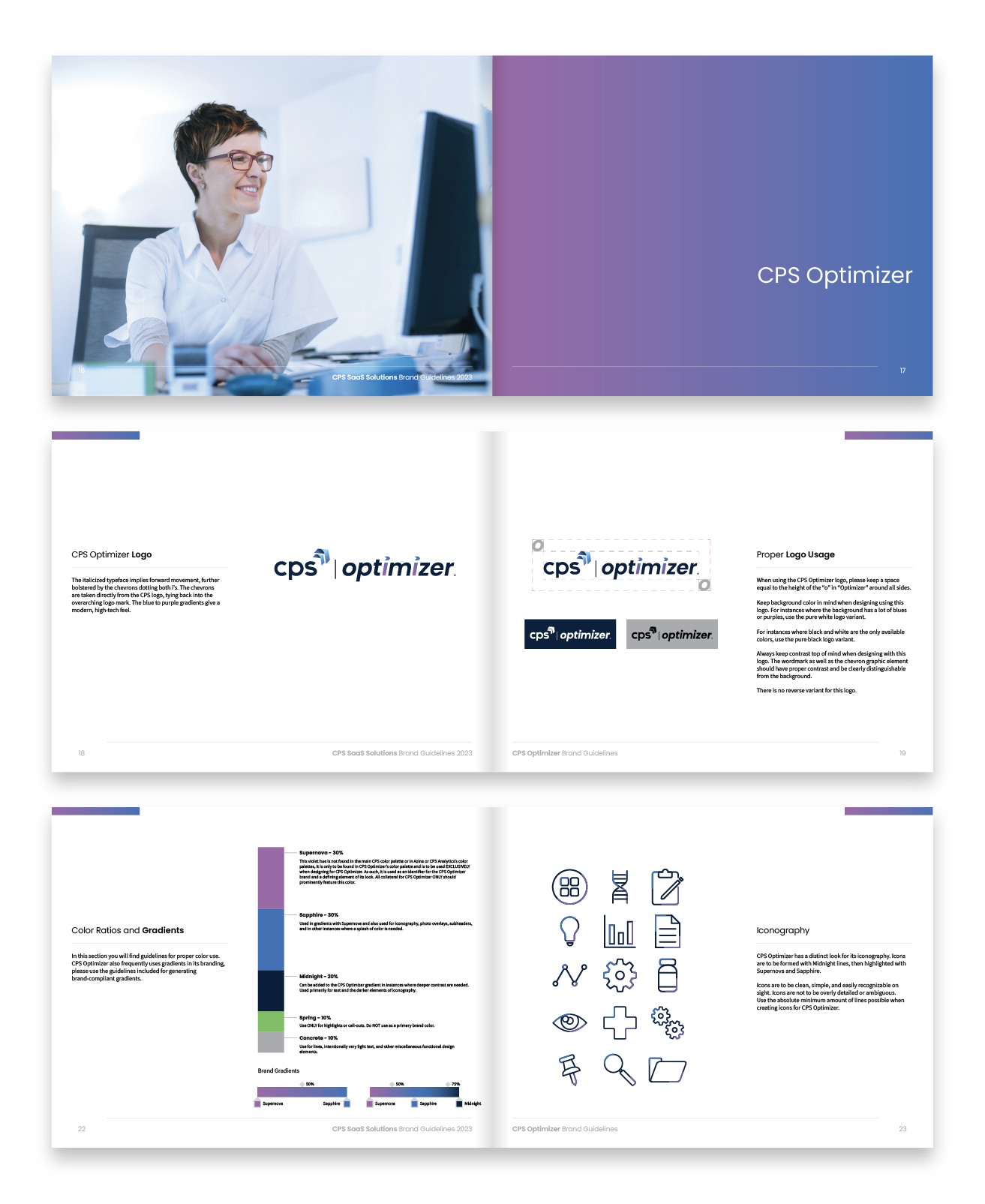
CPS Optimizer
Once the CPS Optimizer logo had been decided upon, the CPS Analytics logo was designed using similar principles, with a bright green replacing the purple to give them two distinct identities.
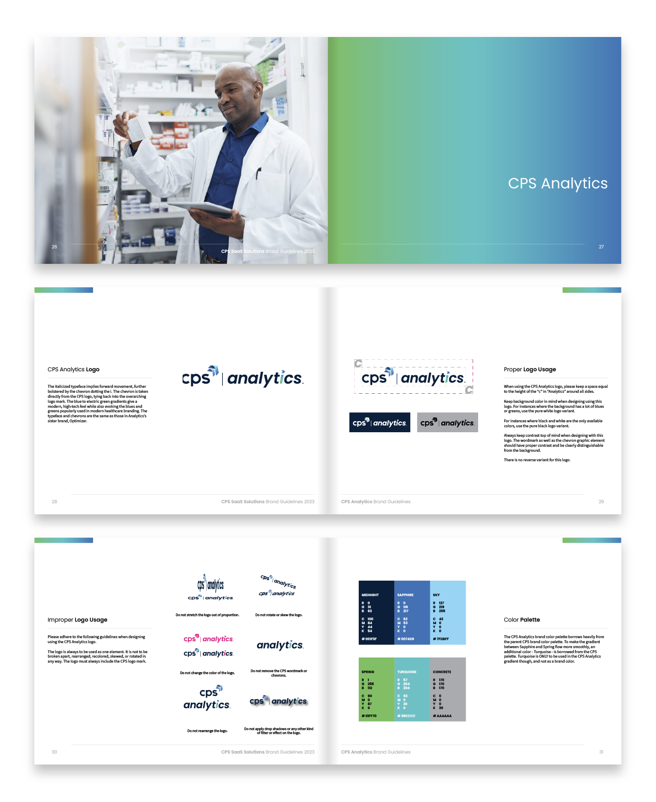
CPS Analytics
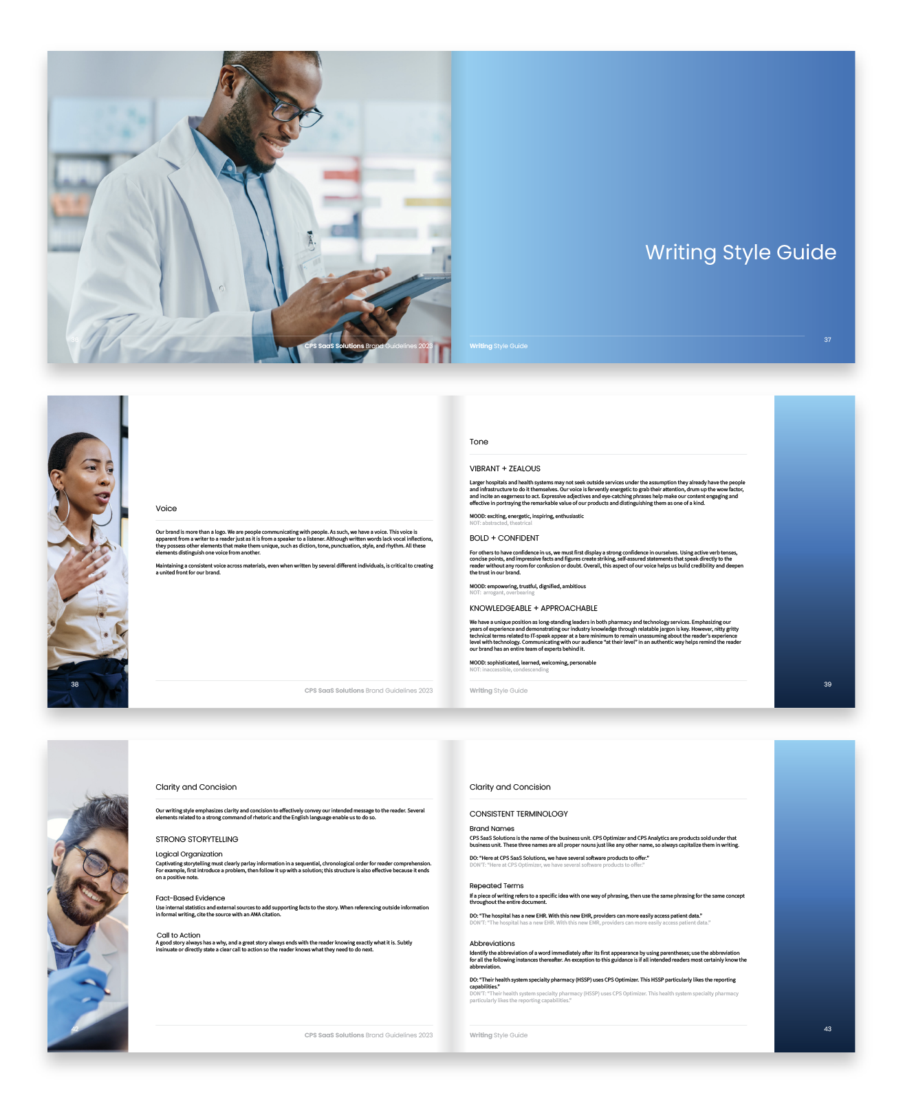
I teamed up with our copywriter to develop an extensive writing style guide for the brands, making sure things like the brand voice, the brand tone, and correct terminology were included.