Diversity, Equity, and Inclusion Subcommittee Logos
As a member of the Diversity, Equity, and Inclusion committee at CPS, I was asked to help brainstorm logos for prospective subcommittees. Below is the logo that was accepted for CLIMB, a group dedicated to uplifting women in business, as well as my final proposed logo ideas for LGBTQIA+, Asian American and Pacific Islander, and Neurodiversity Awareness groups.
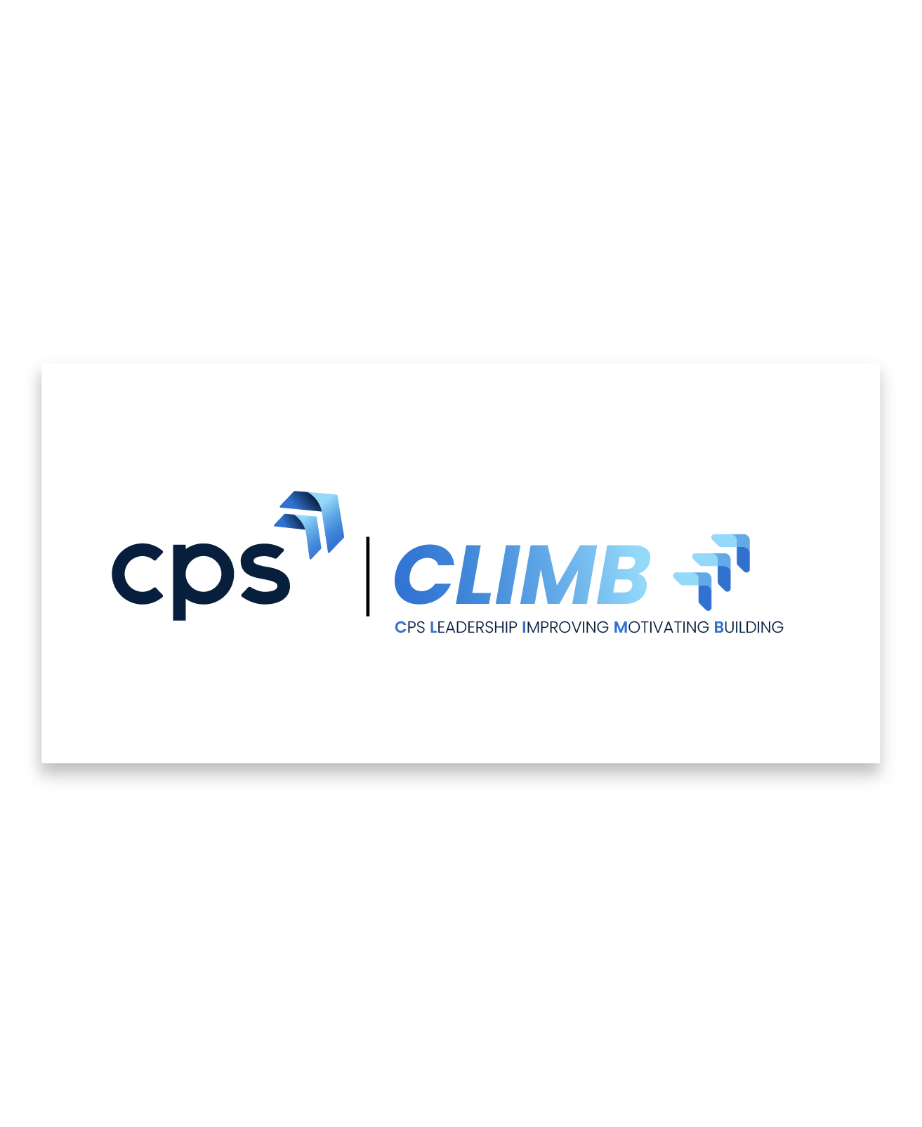
CLIMB - CPS Leadership Improving Motivating Building - is a group of women at CPS dedicated to providing mentorship and support to other professional women. Their original logo was similar, featuring a staircase with stick figures helping each other ascend the stairs, but was made of clipart. I simplified the chevrons in the CPS logo and arranged them to form an upward arrow resembling a staircase. I would go on to use this simplified chevron as a motif in my other subcommittee logos, uniting all the subcommittees under the DEI umbrella.
CLIMB
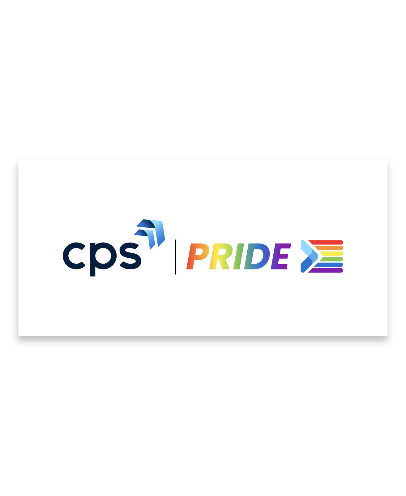
For the LGBTQIA+ subcommittee, I once again used the simplified chevrons to create a design reminiscent of the progress flag. The progress flag is immediately recognizable as a symbol of the LGBTQIA+ community, making the focus of this group clear and direct just from the logo.
PRIDE
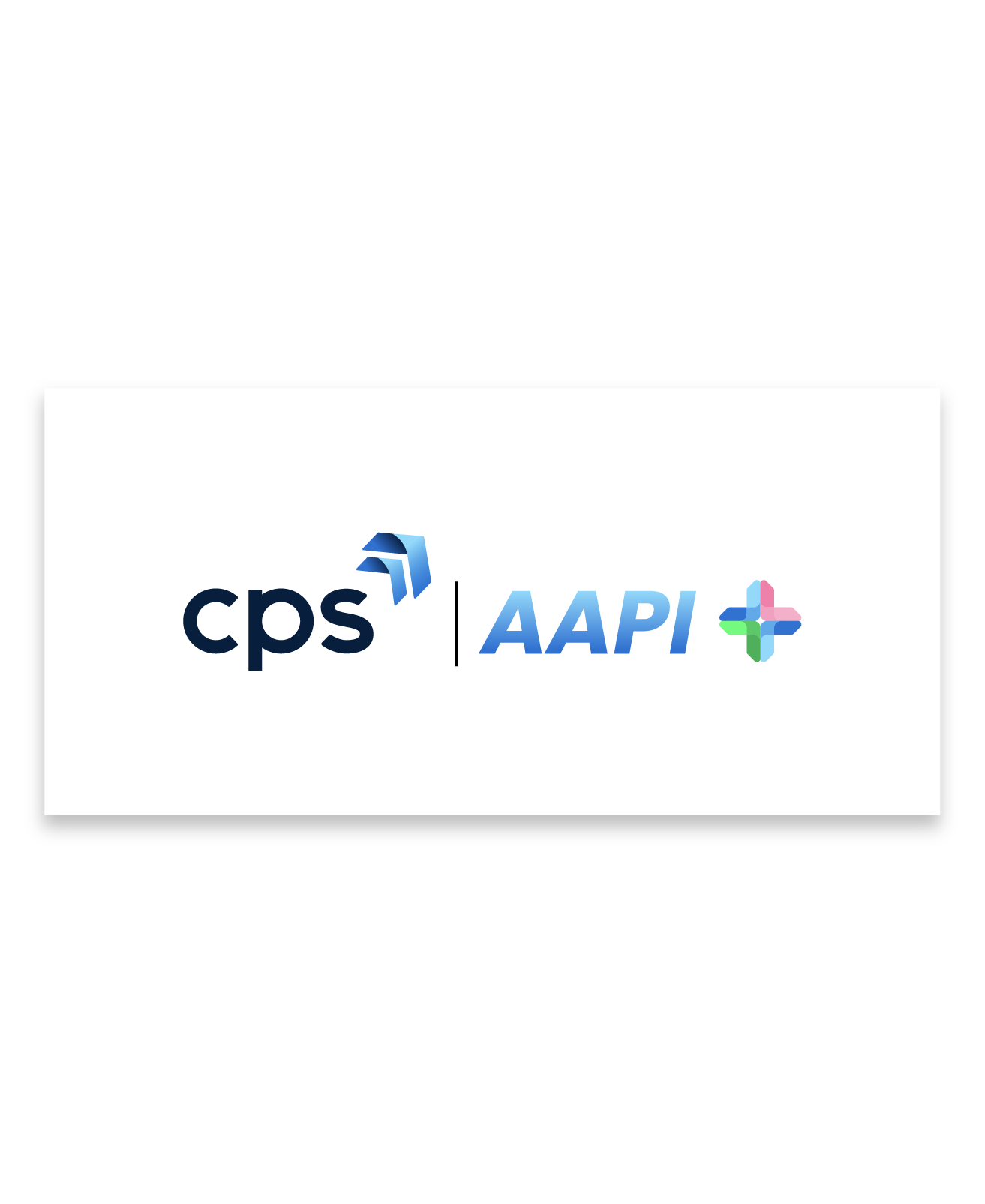
I once again wanted to use the simplified chevrons, but the AAPI subcommittee provided more of a challenge. With there being such a vast array of cultures under the AAPI umbrella, creating a simple symbol that is not only acceptable, but inoffensive, provided something of a challenge. This is my final concept, which requires a bit of explaining. The pointed star is comprised of four chevrons, all pointing inwards, representing the unification of cultures from all four cardinal directions. The upper right chevron is pink, representing the cherry and plum blossoms that bloom in east Asia. The bottom right chevron is blue, representing the Pacific Ocean. The bottom left chevron is green, inspired by Shah Cheragh, the emerald mosque of Iran, and intended to represent the vibrant tilework found in Islamic art. The upper left hand chevron is also blue, representing the vast, open blue skies above the plains of the steppes of west Asia. The four pointed star is also intended to be evocative of geometric fabric patterns that can be found in Japanese, Southeast Asian, and Pacific Islander cultures. I am not of any sort of Asian descent myself, so I asked for thoughts and critique from coworkers and my own husband - who is Filipino - to make sure I hadn’t missed the mark with my intentions.
AAPI
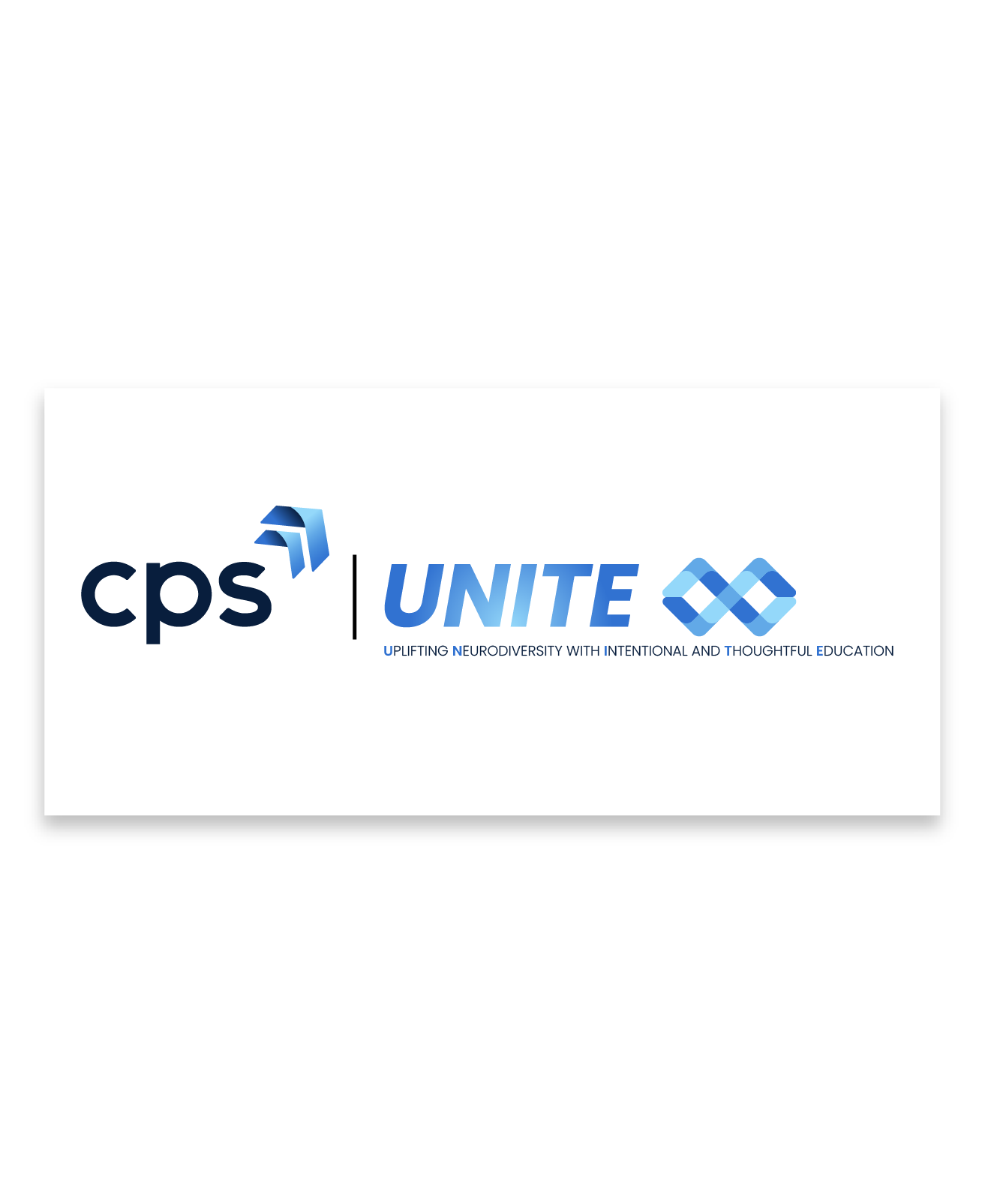
UNITE is an acronym I came up with myself for a prospective neurodiversity awareness group, which stands for “Uplifting Neurodiversity with Intentional and Thoughtful Education”. I used the simplified chevrons to create an infinity symbol, which is a symbol developed by the Autistic community, for the Autistic community. The interlinked chevrons can also represent the never-ending desire to learn, understand, and be mindful of the innumerable ways our minds uniquely work.